.png)
Tools: Figma, Google Suite, Trello
Focus: Design, Research
Investment Platform Widget
Redesigning a Brokerage Account comparison widget to display a wider variety of platforms and improve the comparative value of the experience.

Overview
I was tasked with exploring an update to the current Brokerage Account Comparison widget. The primary goal - to expand the product offerings within the tool and create a more comparative consumer experience.
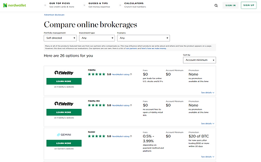
The widget lists investment platforms and their product offering details such as fees or minimums and a promotional offer. Here is the widget that was redesigned.

Screenshot of the widget to be redesigned.
Goals
-
Increase CVR (primary KPI) through the use of our widget
-
Create a more comparative consumer experience
-
Develop a structure that allows us to expand product offerings within widget (e.g., crypto)
-
Redesign for smaller ad units
Screen recording of the widget to be redesigned, containing many of the same elements
Research
I began my research by identifying trends in the investing platform market, exploring relevant investing and banking websites. At the same time seeing how customers are reacting to various platforms and their changes in product reviews as well as competitor sites with similar widgets.
The insights that continued to be relevant throughout the process were the following
-
Most brokerage platforms have $0 basic fees.
-
Competitors typically advertise one of the following after their fee structure
-
Customer service
-
Investing tools/education
-
Non-traditional assets.
-
-
Users want the platform personalized to their level of investing experience.
-
There is a recognized need for help/guidance regardless of investing experience.
-
Modernized UI and interaction is the new standard.

Screenshots of competitor comparison tools
Some more specific user insights from A/B testing our current design and competitor widgets were as follows:
-
Our users are seeking a widget that is streamlined with plenty of information.
-
They love the ability to compare offers and filter through.
-
Users want to get more information without navigating away.
-
There is a recognized need for help/guidance when it comes to investing decisions, regardless of experience.
-
Users want the platform personalized to their level of understanding.
-
The distinguishing factors for experienced investors are promotional offers or the platform’s analytical tools.
-
Inexperienced investors are interested in content and services that help them invest effectively and comfortably - educational materials, customer service, financial advising
-
This information helped me get into the right frame of mind to redesign the widget. With insights into user decision-making and the market of products we could list in our widget it would be easy to deliver a product that would improve the customer’s ability to decide and click through to their desired partner site.
Initial Designs
Redesign Goals
-
Create a widget that allows us to partner with different types of investment platforms.
-
Create a more valuable comparative experience.
How do we do it
-
Expand the filter system to provide more, valuable metrics for comparison.
-
Designing a listing that provides comparable key information quickly.
-
Mobile specific styling for better mobile experience.


Screenshots of early exploratory design ideas for the widget, considering drop-downs and scale sliders for filtering
These are some of the very first design explorations for the new widget. Consolidating the filters was a big part of freeing up valuable space for our listings that would hopefully contain more information. The problem to solve along side the visual reorganization was how to increase the widget's value to the user's decision-making.


Screenshots of early exploratory design ideas for the widget, considering drop-downs and pre-selected filter groupings similar to a tabbed experience
Tech Feasibility
We met with the tech team early on to discuss some concerns with the functionality of the new ad system we wanted to transition to on the back-end. After some reassurances from the tech team we moved forward with some design decisions. From there we moved into user testing for the different designs.
Usability Testing
User testing was a big part of determining the value of the changes we wanted to implement.
-
Starting with a competitive A/B test between the current design and the competitor we decided would be the most valuable to test against.
-
Moving into a usability test to determine the strength of the main design changes we hoped to implement with the redesign.
-
Then into an A/B test to compare the current design and our most developed redesign.
Below you will find mock ups of the designs we tested with. The right side is the redesigned widget.


The previous widget design and the redesign for desktop screens.
.png)
.png)
The previous widget design and the redesign for mobile screens
Overall, the current design scores well in Ease of Use - I believe this can be attributed to the ability to select filters while viewing the listings and no additional step of opening a filter menu.
The redesigns score significantly better on the Value of the Filters/Offers, confirming our belief that additional information on the listings/filters creates a better comparative experience.
-
More information on listings and more to filter with
Based on the scores for Ease of Use it would seem the traditional listing is easier for the user to use, although the difference in score can be, in part, attributed to the only semi-functional prototype per the comments made. The traditional listing is in the Desktop Redesign above.
-
Vertical scroll is a more natural behavior for desktop use
Based on the Ease of Understanding score, the card style listing seems to be more quickly understood by the user. The information is the same, but the grouping of information and spacing of the card listings makes it easier to digest in a glance. The card style listing is in the Mobile Redesign above.
-
Card listings, side-by-side, are easier to understand - preferred on mobile
.png)
Table showing the rating scores of our designs from our usability testing.
* indicates the preferred design
Filtering Options
Overall the filtering options were received well. There was consistently some confusion about what the new Platform Features group entailed. But this confusion was cleared up once users opened the menu.
Other concerns can be attributed to the semi-functionality of the prototype - users question the value of the filters without a clear indication that their filters are changing what is displayed. The ‘pop-up’ interaction becomes a less desirable step for the same reason.
.png)
Table showing a general comparison of Platform Features across the targeted variety of platforms.
I created a very generalized matrix to help visualize the comparability across types of platforms, using the desired filters. This confirms the value of some of the filters in comparing the platforms listed. Along with the rest of our research and testing I was able to confidently decide on the widget filters.
Taxonomy Specifics
We conducted a test to determine the value of a condensed list of platform features we found to be offered by our prospective partners - i.e. phone, email, chatbots as customer support.
The chart below shows the number of people that mentioned the specific feature as something they look for in an investment platform. This aligns very strongly with our initial research and gives us a way to prioritize the listed features.
The chart also contains a column for features that were mentioned for not being included in our list. This, confirmed the value of some groupings and the need to disband other groupings for clarity.

.png)
Partner Listing
Overall the design of the listing was received positively. The inclusion of Fee structure + 3 Platform Features was noted as a positive attribute to the ease of understanding and comparative value of the design.
The same positive comments were made during the Mobile A/B test. 2 users specifically explain that they dislike the horizontal scroll while still selecting their preference for the horizontal scrolling in the final questioning. 15 out of 20 users preferred the horizontal scroll listings.
Final Review
With the design in its final stages, it was time to have a final review with stakeholders from sales, marketing, compliance, and the product team. This would allow us to consider any last minute feedback or explain how it was accounted for in the design.
At the same time, communicating with tech on how to achieve the desired design and functionality. You can see a basic prototype of the widget below along with a gallery of exported frames.