.png)
Tools: Figma, Google Suite, Material Design Library
Google Classroom
An update for the Google Classroom digital learning platform to meet early childhood education formats.


Overview
There is a lack of education platforms catered to early childhood students. They are stuck with boring platforms that disrupt the purposefully structured curriculum.
Below I will go through redesigns I've done of the main pages of the popular Google Classroom after conversations with teachers and research on early childhood education. Focusing on a format that fits early childhood education formats, improving the digital classroom experience for both the students. And maintaining Google's styling.
Screenshots of the existing platform are blurred for the privacy of the teachers, and their students, that helped me with this project.
Redesign
-
Restructure pages to fit the format of early childhood education - one educator leading a class through a variety of subjects with a few other supplementary subjects led by other educators.
-
Insert aspects of delight to match the levels of joy and excitement that in-person teaching can provide, overall improving the digital learning experience.
-
Work within the Google Material Design Library and style guides to create a platform that fits into the Google ecosystem.

Classroom Homepage
Each class has a 'Stream' page where students and teachers can post to the class.
At the head of the page is information about the class and a link to the virtual classroom. And to the left is a short to-do list of your upcoming assignments.
Proposal
The biggest issue here is a lack of hierarchy, important teacher posts get drowned out by other posts. Google Classroom has a function to re-elevate your post to the top of the feed, but it simply isn't enough in this setting and with this teaching style.
-
The first update is allowing teachers to pin posts, saving everybody time and energy.
-
Another update would be an indicator for live video sessions. In the existing design there is nothing other than a link posted by the teacher, which is easy to miss.
-
Creating digestible groups of information that make it easier to understand what's happening today, tomorrow, or what's already happened.

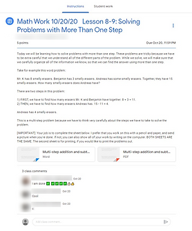
Classwork Assignment List
The second most used tab is the Classwork tab, where student's access their assignments.
Here students have access to a single list of all of their assignments for the year. This seemingly endless list of assignments is daunting and unenticing.
This page nullifies any excitement to do an activity, something important in early childhood education.

Proposal
With teaching plans in place from the start of the year - usually organized by date and then by subject - I thought a calendar would be an effective way to organize and view assignments for both students and teachers.
-
Differentiate assignment subjects, something the teachers do on their own.
-
A new ‘Assignment Status’ to represent progress.
-
With a quick visual reminder of their work, the students are incentivized to complete their work. Gamifying the learning experience.
-
-
The assignments can be filtered by subject or by date, the way they are initially created. Creating a focused and organized view of assignments that is less overwhelming.
-
Since learning the calendar is part of early childhood education, this version of a calendar labels three days - yesterday, today, and tomorrow.
-


Assignment Page
When a student clicks on an assignment, they are brought to a new page with instructions. Below the assignment, there is a space for comments from the class.
There is also a separate tab for the student to attach their work and two different spaces to leave comments for either the class or for the teacher.
This sub-navigation creates an unnecessary separation between the assignment and the classroom environment. And the two separate class comment sections create a confusing redundancy.
Proposal
To improve students' interactions with their assignments, I condensed them into one page where the students can either comment on the assignment or speak privately with a teacher about it.
-
Continue representing the student's work status with the new ‘Assignment Status' above the student's attachments; along with 'done' and 'attach' buttons colored to match the status they represent.
-
Quick status reminder
-
Incentivize assignment completion
-
-
A single page allows the students to work on their assignments and communicate with their peers or teacher without navigating away from the classroom space.


To-do List
The existing to-do list falls short in the same ways as the classwork list: it's a boring list without any hierarchy.
Proposal
With the introduction of an ‘Assignment Status’, it is easy to organize to-do list items by assignment status and prioritize your work.
-
Create a digestible visual of the day’s work and incentivize the student to complete their assignments.
-
Users would be able to filter the items by date, subject, and assignment status creating an actionable list.
-
This way a child's guardian can also quickly identify work to be done.
-


Grades Page
The current grades page is a quickly designed spreadsheet template. While it is more effective for a curriculum with fewer assignments, it creates a clunky experience for early childhood educators managing multiple subjects and class sizes that won't fit on a single screen.
Proposal
-
Continuing to implement the ‘Assignment Status’ as well as the ability to filter by subject quickly improves another dull and cluttered page.
-
Create a table of information that is easier to digest with a quick glance by the teacher.
-
This also gives parents an easy view of their child's work with just a few clicks.
-
-
Incentivize completing assignments with the introduction of the colored assignment status.
Thinking Ahead
While I think that young students would benefit from a more interactive digital environment to replace the in-person setting, I decided not to overcomplicate the interface and tried to maintain the Google aesthetic. I hope to continue working on what a more exciting, digital education environment might look like, including the video meeting screen, which has incredible potential for engaging younger students during lessons and replicating the in-person experience of a classroom. These things could be interactive illustrations to gamify assignment submission or digital avatars to dress up for the day's lessons.