.png)
Role: Lead Designer
Tools: Figma, Google Suite, Trello, Jira, UserTesting.com
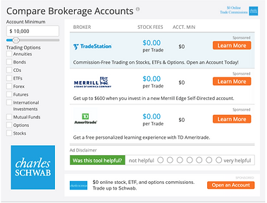
Investment Platform Widget
Redesigning a Brokerage Account comparison widget to display a wider variety of platforms and improve the comparative value of the experience.
Overview
The task was to upgrade an existing widget used to compare brokerage accounts in order to expand the product offerings to non-traditional investment platforms and create a more comparative consumer experience between them. A recent visual update for a similar, high-performing widget was very successful. And so the hope was to replicate that success in conversion as well as attract more advertising partners.
Goals
-
Increase click-through rates for our partners through the use of our widget.
-
Create a more broadly comparative consumer experience.
-
Develop a structure that allows the listings to expand to a wider variety of product offerings within the widget (e.g. crypto).
-
Redesign for smaller ad units.
.png)
.jpg)
Before (left) and After of the full redesign up to handoff
Redesign
-
To improve the comparison across platform types, we introduced new filters and key information bits to help users at a glance and entice them to find out more
-
Striking the balance between informative and easy-to-understand.
-
Testing language and filter rankings.
-
-
Designing a specific mobile style with our audience shifting to mobile browsing.
-
Working with the tech team to determine the feasibility of certain functionality and design changes; finding a compromise that meets both the project expectations and project allocations.
Research Approach
-
Competitive deep-dive into our direct competitors like BankRate and NerdWallet.
-
Our visual design is dated, but our functionality is on par
-
Tabbed experiences are popular.
-
-
Research to better understand the evolving landscape of personal investment platforms and how they are discussed.
-
Blogs and websites like StockBrokers.com have in-depth comparisons.
-
What features are important and sought after by the average investor.
-
-
A/B testing current state against competitors and each design iteration thereafter.
-
Broad filtering across platform types did well in testing.
-
-
Usability testing design iterations and feature explorations.
-
Visual representation of function like a result counter or loading animation will be helpful with a large inventory and small container.
-


Competitor site comparison pages/tables
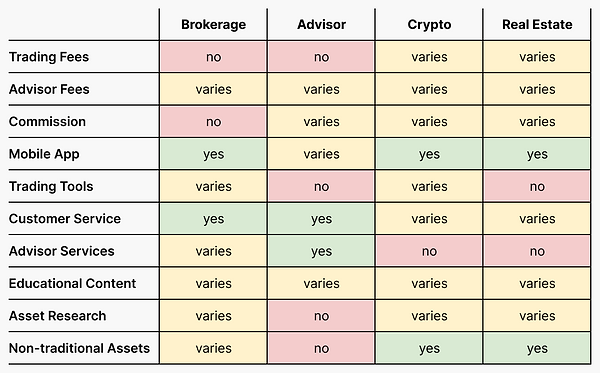
Filtering Options
Overall the filtering options were received well in the user tests. There was consistently confusion about the label 'Platform Features', so plans are to test other options live.
I created a generalized matrix (A) to help visualize the comparability across types of platforms, using the desired filters. This helped confirm the value of some of the filters. Along with the rest of our research and testing, I was able to confidently decide on the feature filters and listing details.
.png)
Table A showing a general comparison of Platform Features across the average variety of platforms.
.png)
Table B showing popularity of platform filters
Taxonomy Specifics
In our user tests we surveyed our users to determine the value of a condensed list of platform features (B) we found offered by our prospective partners - i.e. phone, email, chatbots were condensed customer support.
The chart to the right shows the number of people that mentioned the specific feature as something they look for in an investment platform. This aligned very strongly with our initial research and gives us a way to prioritize the listed features.
Findings
-
Fees and investment minimums are the key concern of our users, regardless of the comparative value.
-
The average user is not well versed in personal investment, so there is a balance to strike between informative and understandable.
-
Modern UI, quick information, and easy comparison were identified as the winning aspects for a financial widget.


Early design mocks for the widget redesign. Exploring a mixture of inputs and information displays.
Usability Testing
User testing was a big part of determining the value of the changes we implemented.
-
Starting with a competitive A/B test between the current widget design and a competitor we decided was the most valuable to test against.
-
Moving into a single usability test of our first iteration to determine the strength of the main design changes we hoped to implement with the redesign.
-
Then into an A/B test to compare the current widget design and our most developed redesigns.
Below you will find mock ups of the most developed designs we tested with in the third round of testing. The right side being the redesigned widget.


The previous widget design and the redesign for desktop screens.
.png)
.png)
The previous widget design and the redesign for mobile screens.
Overall, the current design scored well in Ease of Use - attributed to the ability to select filters while viewing the listings and no additional step of opening a filter menu. Showing value in an single click experience.
The redesigns scored significantly better on the Value of the Filters/Offers, confirming our belief that any additional information about the offers listed and filters creates a better comparative experience.
-
More information on listings and more to filter with is a win!
Based on the scores for Ease of Use it the traditional listing was easier for the user to use, although the mobile-first horizontal scrolling won out in the users final preference.
The traditional listing is shown in the Desktop Redesign above.
-
Vertical scroll is a more natural behavior for desktop use.
Based on the Ease of Understanding score, the redesigns are a success. The content is the same, but the extra information makes it easier to get a full view in a glance.
.png)
Table showing the rating scores of our designs from our usability testing.
* indicates the preferred design.
Final Design
With the design in its final stages, it was time to have a final review with stakeholders from sales, marketing, compliance, and the product team. This would allow us to consider any last minute feedback or explain how it was accounted for in the design.
At the same time, communicating with tech on how to achieve the desired design and functionality. You can see a basic prototype of the widget below.
Final design change summary:
-
Broader-reaching filter options for non-traditional investment platforms.
-
Consolidated filter menus to include more filters for the developing landscape of personal investment apps
-
Results counter to display changing results.
-
Fee and features display from a pre-determined list that we ask from our partners.
Thinking Back
Thinking back on the process, here are some learnings
-
It is important to separate the product vision from the product requirements and design for the immediate use case while you build towards a product vision.
-
Learn about product functionality and limitations as early as possible from every team involved in the process.
-
Work with the engineering teams early on to determine feasibility of more complex features and have an open discussion about what you hope to implement and how it might be possible. Compromise is good!
-
I really enjoy the challenge working within design constraints and maintaining a design scheme.